|
|
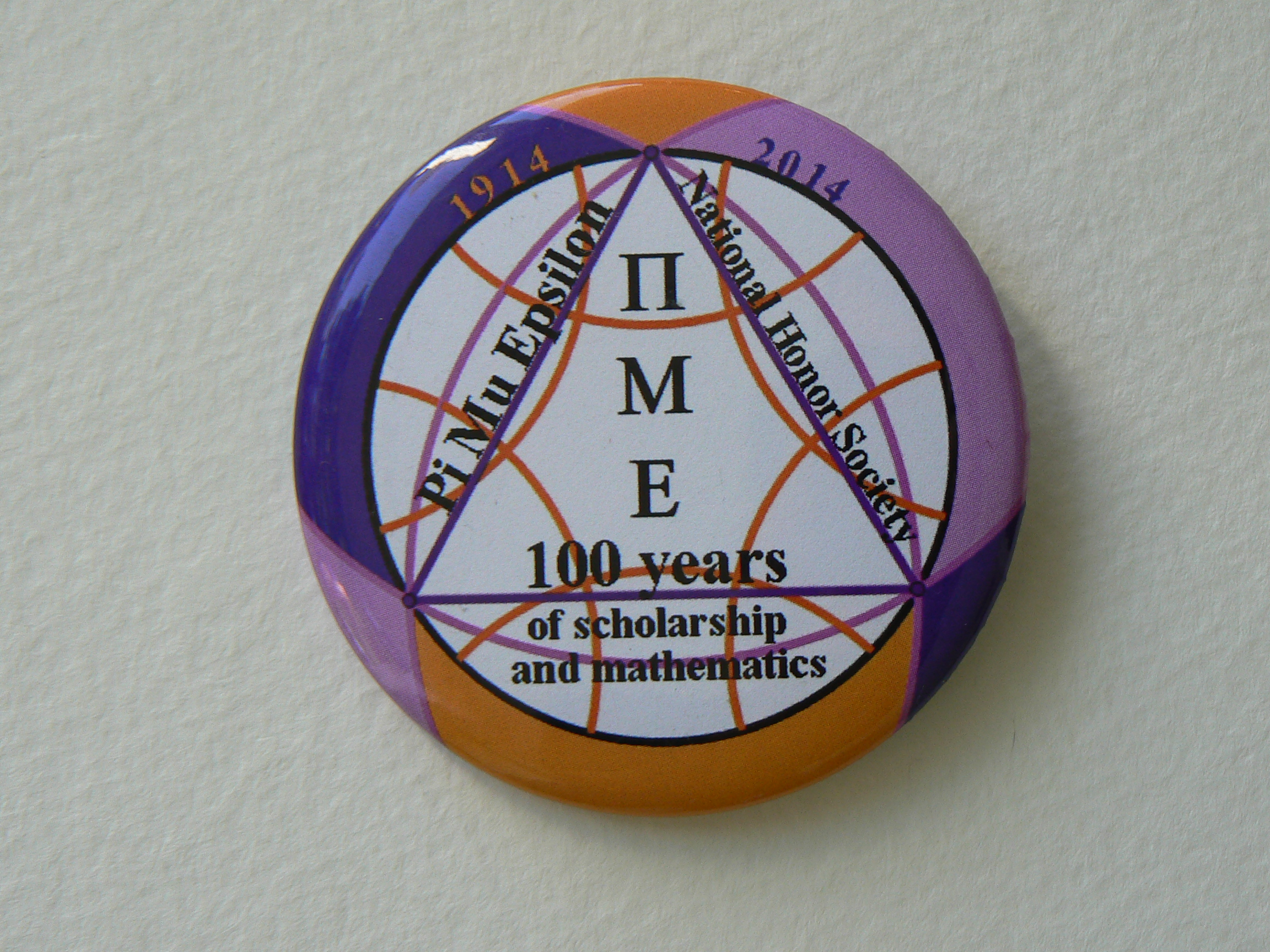
Michigan Lambda The six gold arcs are orthogonal to the inner circle and each other, forming a regular hyperbolic hexagon, if we take the inner circle for the boundary. The three lavender arcs pass through pairs of antipodal points on the outercircle (though this relationship might be lost when the badges are mounted.) The lavender arcs also form a Realeaux triangle inside the inner circle. The inner circle has half the area of the outercircle, (Euclidean measure). The Euclidean equilateral triangle in violet anchors the entire structure and the Greek letters down the middle of the triangle are meant to invoke the PME Key. One of our students remarked about the position of the letters ME, "That's me in the honor society!
Ohio Sigma
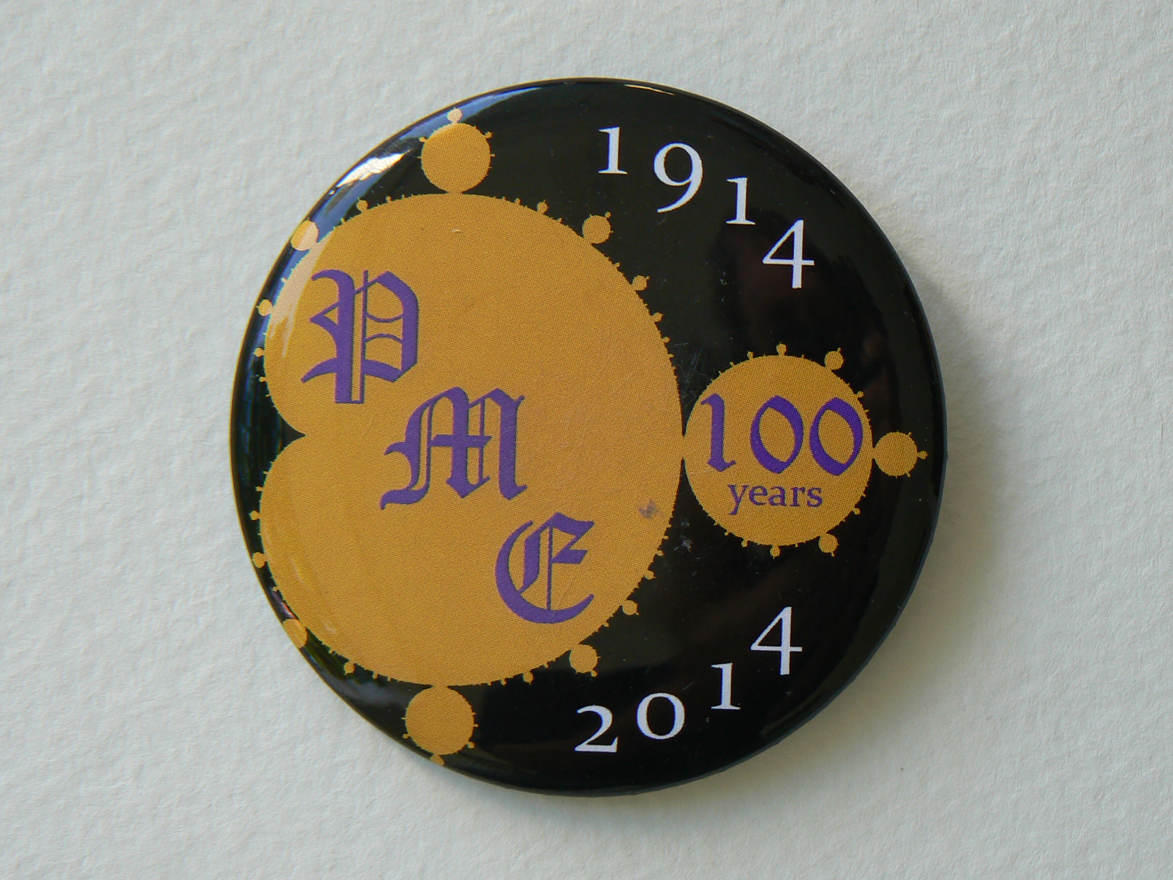
My goal was to create a design that would stand out and be immediately associated with mathematics. “The Mandelbrot set has become popular outside mathematics both for its aesthetic appeal and for being a complicated structure arising from a simple definition, and is one of the most well-known examples of mathematical visualization” (Wikipedia). The final design, in PME colors, is simple, bold, and easily understood.
Oregon Delta
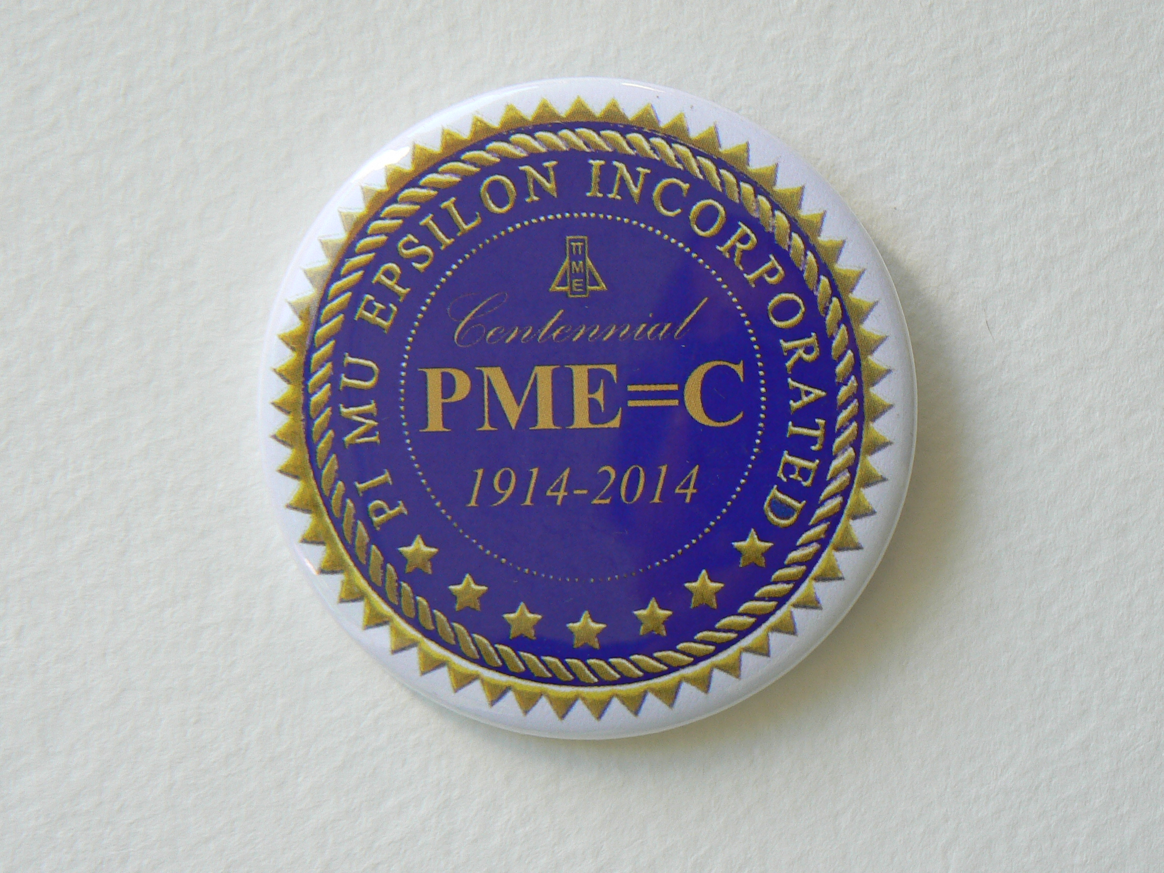
The Oregon Delta button is a modified Pi Mu Epsilon seal. At first glance, it has an elegant, serious appearance, with "Centennial" and "1914 - 2014" making clear the event we are celebrating. On closer inspection, the equation "PME = C" in the center adds a bit of mathematical whimsy by indicating the age of Pi Mu Epsilon in Roman numerals. Elegance with a twist inspired our design.
Florida Epsilon
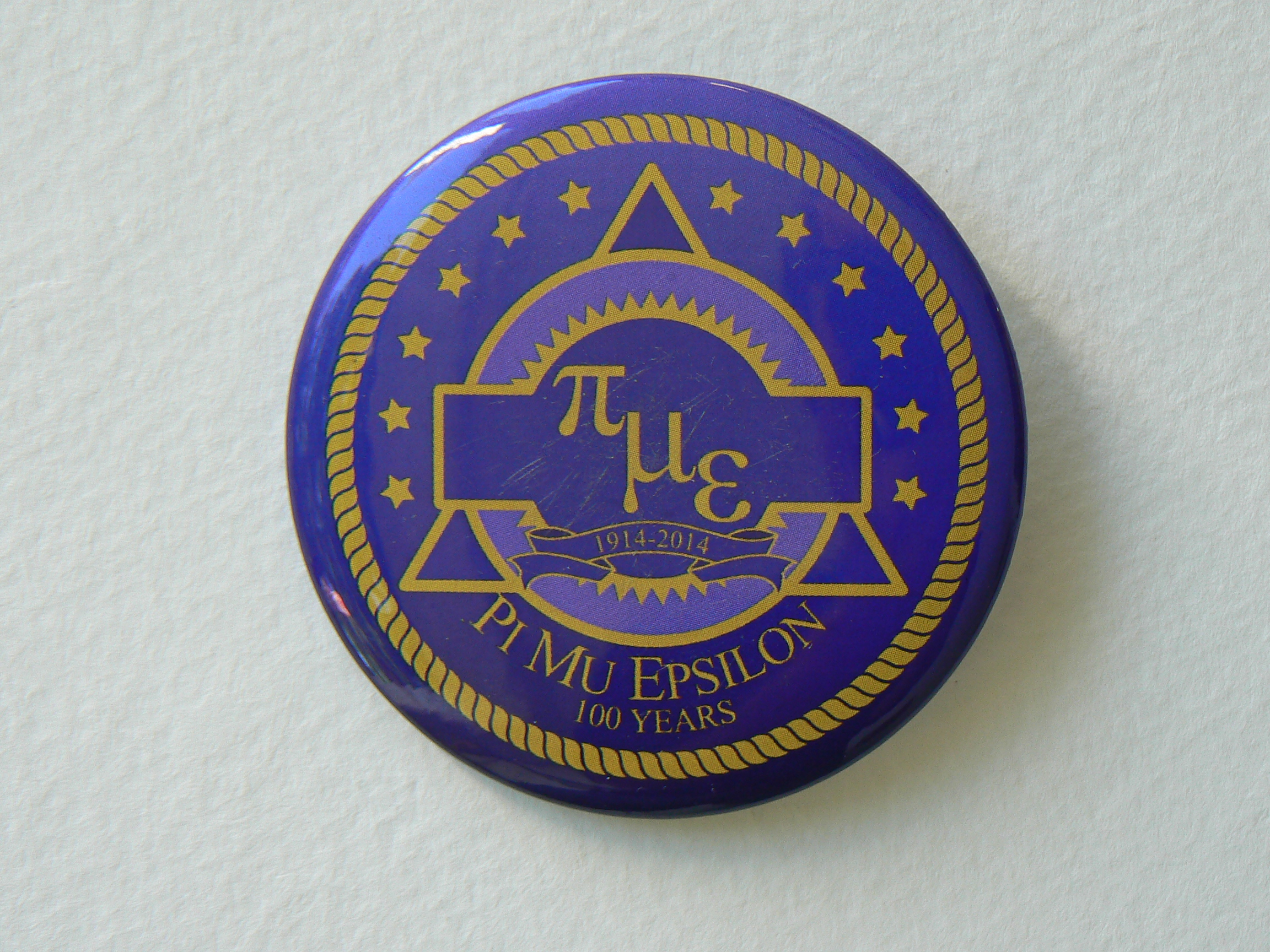
I drew inspiration from a previous PME sticker design, and in the spirit of tradition I kept many of the former elements: The sun rays, the rope border, the stars, and the original purple & gold color palette. In the spirit of change and innovation I decided to diagonalize the PME letters, and lower-case them. The previous logo included in the center with the letters a triangle and a rectangle, two very familiar geometric shapes. I decided to incorporate a third, the circle, in my design with the triangle and quadrilateral. I also added the commemorative banner and the "100 years" line to reflect PME's centennial celebration. |